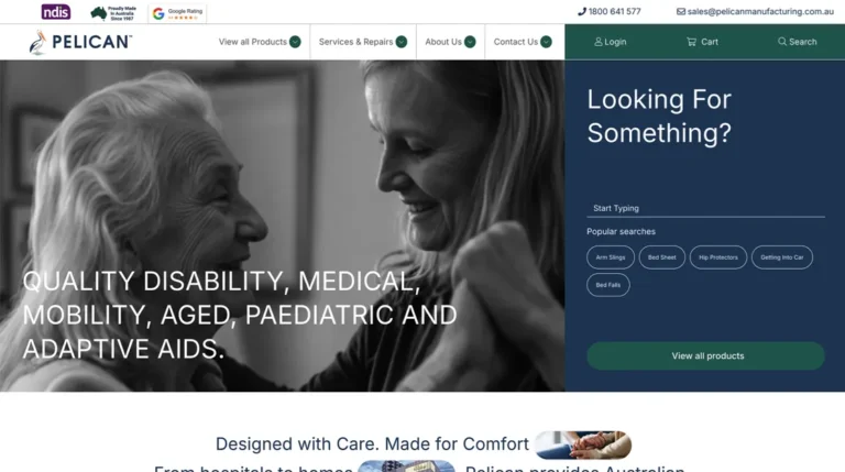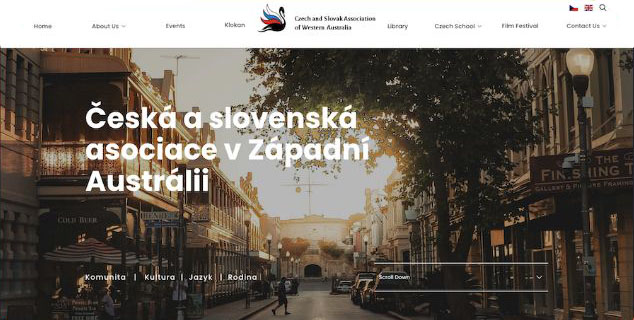
Many businesses fall into the trap of viewing their website as a purely artistic portfolio. They overload pages with heavy background videos, complex loading animations, and abstract structures in an attempt to look cutting-edge. In practice, this design philosophy achieves the opposite of its intended goal. Cluttered layouts add friction, slow down mobile devices, confuse visitors, and cause enquiry rates to plunge.
Modern user experience (UX) data indicates that the highest-converting websites rely on a philosophy of “Clarity-First Design.” When a user lands on your site, they should not have to hunt for information. A clean, lightning-fast interface that values the user’s time will outperform a complex, over-designed layout every single time.
The 3-Second Hero Rule
The space above the fold—the very first screen a visitor sees before scrolling—is the most valuable real estate on your entire digital asset. Within three seconds of landing on this section, a user must be able to answers three fundamental questions:
- What do you actually do? (Clear, direct statement of your primary service).
- How does it make my life better? (The core benefit or problem solved).
- What do I do next? (A highly visible, single call-to-action button).
If your hero section features a vague tagline like “Innovating for a brighter tomorrow” instead of “Bespoke Web Design for Perth Small Businesses,” users will bounce. Keep your primary headings grounded in concrete reality and place your contact or quote button directly underneath it.
Put Social Proof Where It Matters
Trust is the primary currency of the internet. Many businesses hide their client testimonials on a dedicated “Reviews” page that visitors rarely click. High-converting layouts integrate social proof directly into the natural flow of the primary landing pages.
Place real-world validation near your points of friction. Embed a snapshot of your five-star Google rating right inside the hero section. Place brief, text-based customer quotes immediately adjacent to your service options or right next to your final contact form. When a prospect feels a moment of hesitation before filling out an enquiry, seeing immediate proof of your local track record mitigates their risk.
Designing for Mobile Interactivity
A massive percentage of your traffic arrives via smartphones, often while multitasking or using cellular data. A desktop layout shrunk down to a mobile screen is a major UX failure.
Clarity-first design prioritizes mobile thumb zones. This means navigation menus must be easy to toggle, buttons must be large enough to tap effortlessly without accidental misclicks, and text sizes must remain highly legible without pinching or zooming. By stripping away non-essential design elements and focusing purely on speed, legibility, and a clear path to conversion, your website transforms from a passive digital brochure into an active lead-generation engine.
 our work